Color is one of the most immediate and influential elements in food packaging. Before the consumer reads labels or logos, the dominant shade already communicates values, quality, and perception of the product.
In the food sector, this applies everywhere: in retail, in catering, in takeout, at events, in catering, and in artisanal products. Color communicates freshness, quality, price range, and positioning in a matter of moments.
It is not an aesthetic choice. It is a strategic decision that can influence up to 60–70% of purchasing decisions.
That’s why talking about the importance of colors in food packaging means talking about perception, psychology, and brand value.
Why color influences purchase decisions
Color is the first element that the brain processes. In the food sector, it immediately conveys implicit information that guides the choice.
It directly impacts:
- Perception of healthiness
- Taste intensity and expectation
- Perceived economic value
- Target audience
Warm shades stimulate appetite and immediate attention, while cool ones suggest balance, lightness, and control.
In other words, colors in food packaging do not decorate the product: they guide behavior.
The meaning of colors in food packaging
Every color activates precise mental associations. The choice must be consistent with the product category and the brand positioning.
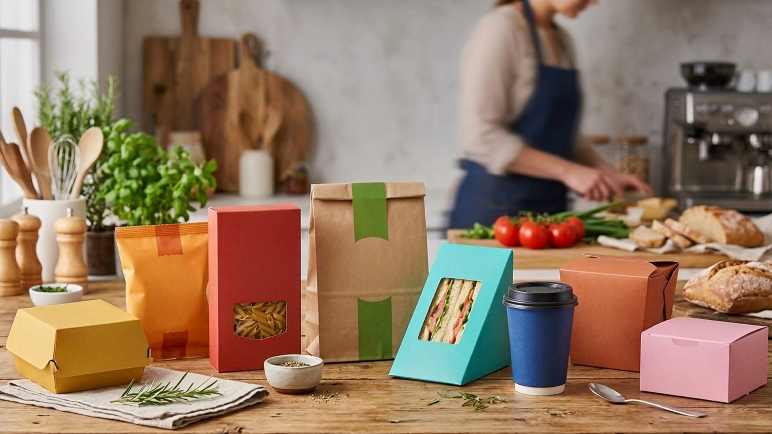
- Red, orange, yellow → energy, vitality, appetite. Common in snacks and dynamic products.
- Green → nature, sustainability, wellness. Dominant in organic and plant-based products.
- Blue and light blue → freshness, purity, reliability. Used for beverages and light lines.
- White → cleanliness and simplicity. Common in dairy products and light lines.
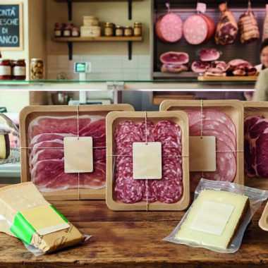
- Brown → tradition and authenticity. Typical of whole grains, coffee, chocolate.
- Black and gold → elegance and premium range. Ideal for gourmet products.
Context remains crucial: an effective color in one category can seem inconsistent in another.
Consistency between color and expectation
The history of food marketing demonstrates how crucial chromatic consistency can be.
An emblematic case is that of Crystal Pepsi, launched in the ’90s with a clear liquid to communicate purity. The problem was the mismatch between color and expectation: consumers associated cola with dark color. The discrepancy generated disorientation and the product was withdrawn.
The principle is clear: when the color does not accurately anticipate the experience, trust diminishes.
Saturation, brightness, and perceived value
It’s not just about the hue of the color, but also how it is used. Light and less saturated shades reinforce the perception of lightness and healthiness, while intense and contrasting colors convey pleasure and a strong visual impact.
The careful management of the color palette helps define the positioning of the product without altering the recipe or actual quality.
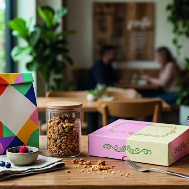
Color and packaging personalization
Today, color serves not only to distinguish a product from the competition: it is an essential tool for customizing the packaging in line with the brand’s identity.
Choosing palettes consistent with values, target, and positioning allows you to:
- Strengthen brand identity in every package
- Convey consistency between physical experience and product perception
- Make every container immediately recognizable, even in digital contexts like social media or delivery
Thus, every color choice becomes a strategic element, an integral part of business communication and not just an aesthetic detail.
Technical aspects and production consistency
Color management is also a technical issue: professional printing uses systems like four-color process CMYK or Pantone color scale to ensure uniformity and visual consistency over time, a fundamental element in building brand recognition and reliability.
Furthermore, color affects the readability and accessibility of printed information: insufficient contrasts or poorly designed palettes can compromise the consumer experience. To delve deeper into this aspect, you can read our article on Inclusive and accessible food packaging.
Color and presence in new contexts
With the rise of delivery, outdoor spaces, and digital communication, packaging has become an integral part of the visual experience.
A distinctive color increases:
- Brand memorability
- Recognizability on social media
- Consistency between physical and digital experience
In this scenario, colors in food packaging are not a graphic detail, but a strategic choice integrated with materials, shape, and identity.
This is the importance of colors in food packaging: a lever capable of influencing perceptions, choices, and value through consistency, strategy, and technical precision.
Discover the modern, professional, and customizable solutions from DOT – HoReCa Solutions.